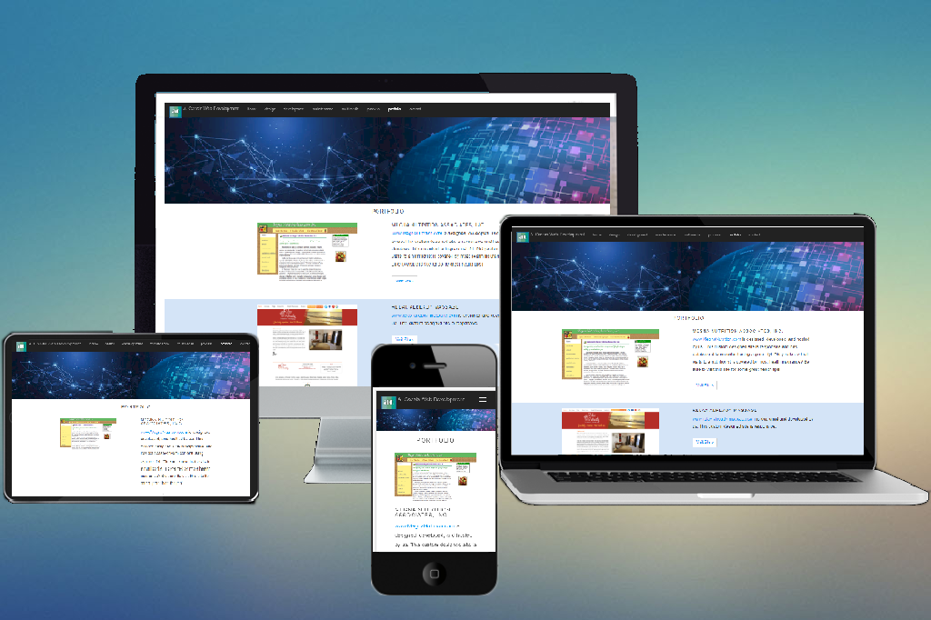
a. cassis web development a. cassis web development topright.jpg (1609 bytes)
 home
 design
 development
 maintenance
 database integration
 graphics
 multimedia
 process
 portfolio
 contact


web design


What makes a well designed web site?  We create all of our pages user-friendly.   Lots of sites do not create user-friendly pages.  Ever see a site that says "best viewed at 1024x768 pixels"?  You should never have to change your settings to be able to view the page correctly.  That's not a "user-friendly" site.  Some web design companies focus on slick graphics or flashy animation. Some focus on information, features, and eCommerce.

These are all important aspects of web sites, but if you are a business and you have a web site, there is one simple goal you have in mind:

Your web site should generate revenue for the company.

Most companies should start their web design project by finding out ways in which they can provide true customer value on their site. Give users benefits from spending time on your site, allow them to do business with you, and their money will follow.

Who is your audience?  The site should be designed with customers' needs in mind and not to promote ideas of self-importance. Do not build a site that your top executives like: most of the time, they are not the target audience.

Here is what is involved in web design:

  • Graphics
  • Navigation
  • Page Layout
  • Clarity of Message
  • Contact Gathering
  • Web Site Exposure
  • Comparison to Competitors

Designing web sites with these criteria in mind creates web sites that not only look good and are easy to use, but that also increase the business generated by your web site.

10 signs of bad web design

Here are 10 sure signs of an amateur website. Don't let this happen to you by letting someone inexperienced design your website:

  • Little or no useful content. Visitors won't stick around unless there is real content and not just a simple sales pitch.
  • Misspelled words, typos, and bad grammar. There is nothing more unprofessional than having spelling and other language errors on a website.
  • The "too many" syndrome. Too many colors. Too many font sizes. Too many "cute" graphics that don't add value and increase download time.
  • Gratuitous Flash or animations. Many animations are put on websites for no reason than to impress other web designers. An uncluttered, well-organized website will have a greater impact than one that uses intrusive animations that distract from a your message.
    Huge graphics or photos that take forever to download. All graphics should be compressed and optimized for the Web.
  • Tacky clip art. We either modify stock clip art as needed or create graphics from scratch to ensure your website has a professional and distinctive look.
  • Text too big, all upper-case, or blinking. Upper-case text should be used sparingly for emphasis only. Blinking text is distracting and will interfere with your message.
  • Bad color combinations that make you dizzy or background graphics that make it difficult to read text on a page.
  • No apparent means to navigate through the website or to return to a previous page. Easy-to-use websites have a logical structure and use navigational elements in a consistent manner.
  • Not optimized for search engines. Many websites are not using titles and keywords correctly, or contain code that penalize their rankings in the search engines. Search engine optimization is extremely important if you want anyone to find your website.

Contact us for more info.


leftbottom.jpg (1745 bytes) home | web design | development | maintenance | database integration | graphics | multimedia | process | portfolio | contact